
Visual identity for
FESTIVAL
STIČNA MLADIH
2021
CLIENT – Stična mladih
KEYWORDS – branding, merchandise, event design
TEAM MEMBERS – Marko Javeršek & Kaja Bukovec
YEAR – 2021
PROJECT / CLIENT DESCRIPTION
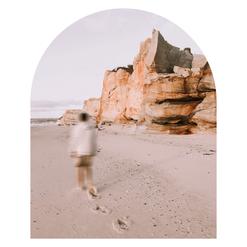
Stična mladih is the biggest Slovenian youth festival with 40 years of tradition and recognition. Every September, it attracts more than 4000 young people who want to deepen their faith and become better humans. The Festival lasts one day and includes concert, workshops, chill out zones, sports activities and mass.
MY ROLE – core organizational team member, graphic design, web design, merchandise, promotional material, app UI/UX, 3D design, merchandise, animation for big screens, motion graphics
CHALLENGE, PROCESS
& SOLUTION
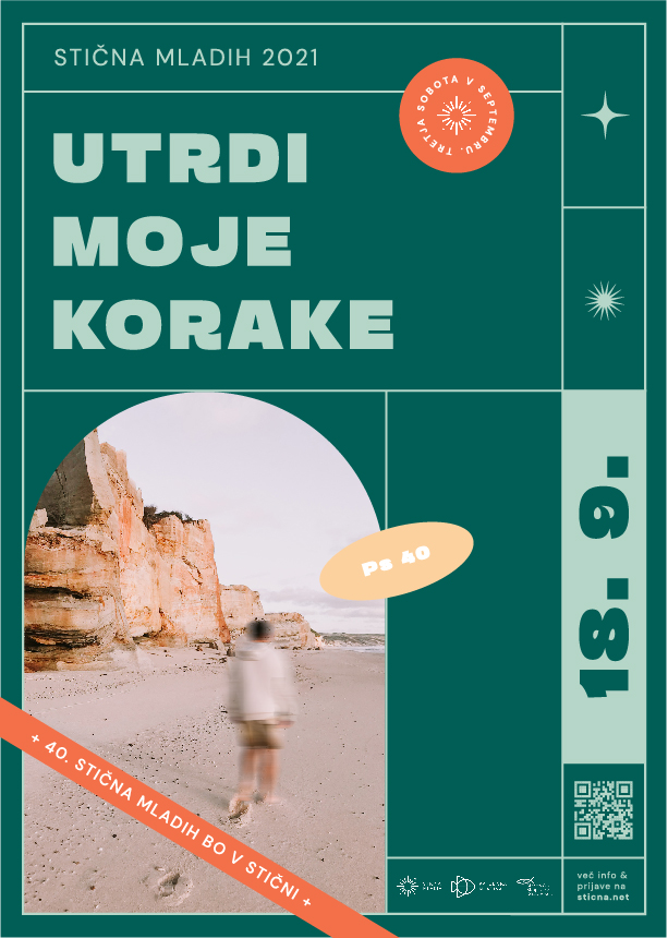
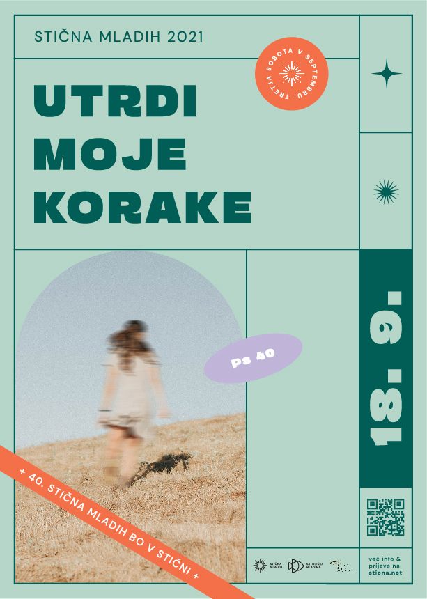
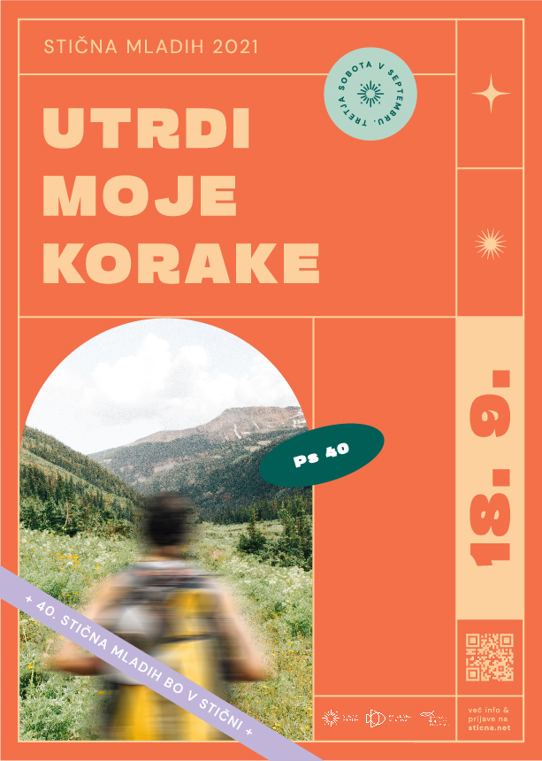
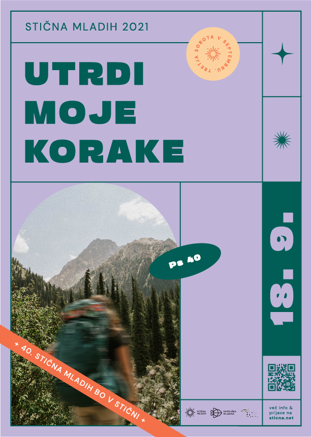
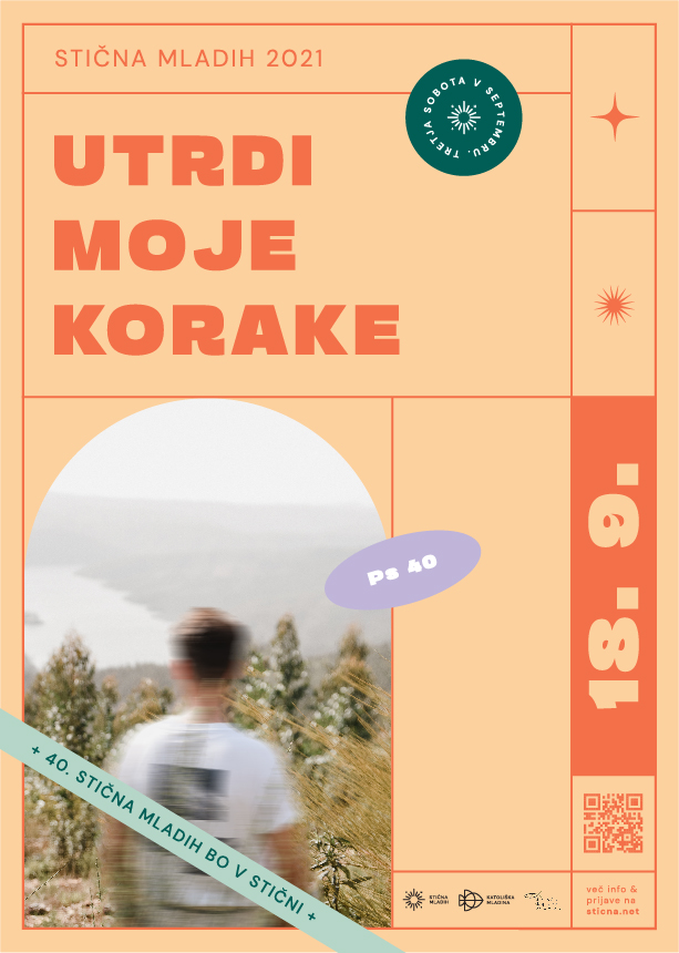
In 2021, the festival Stična mladih celebrated 40 years of existence so the media presence and visitors expectations were high.
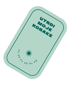
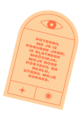
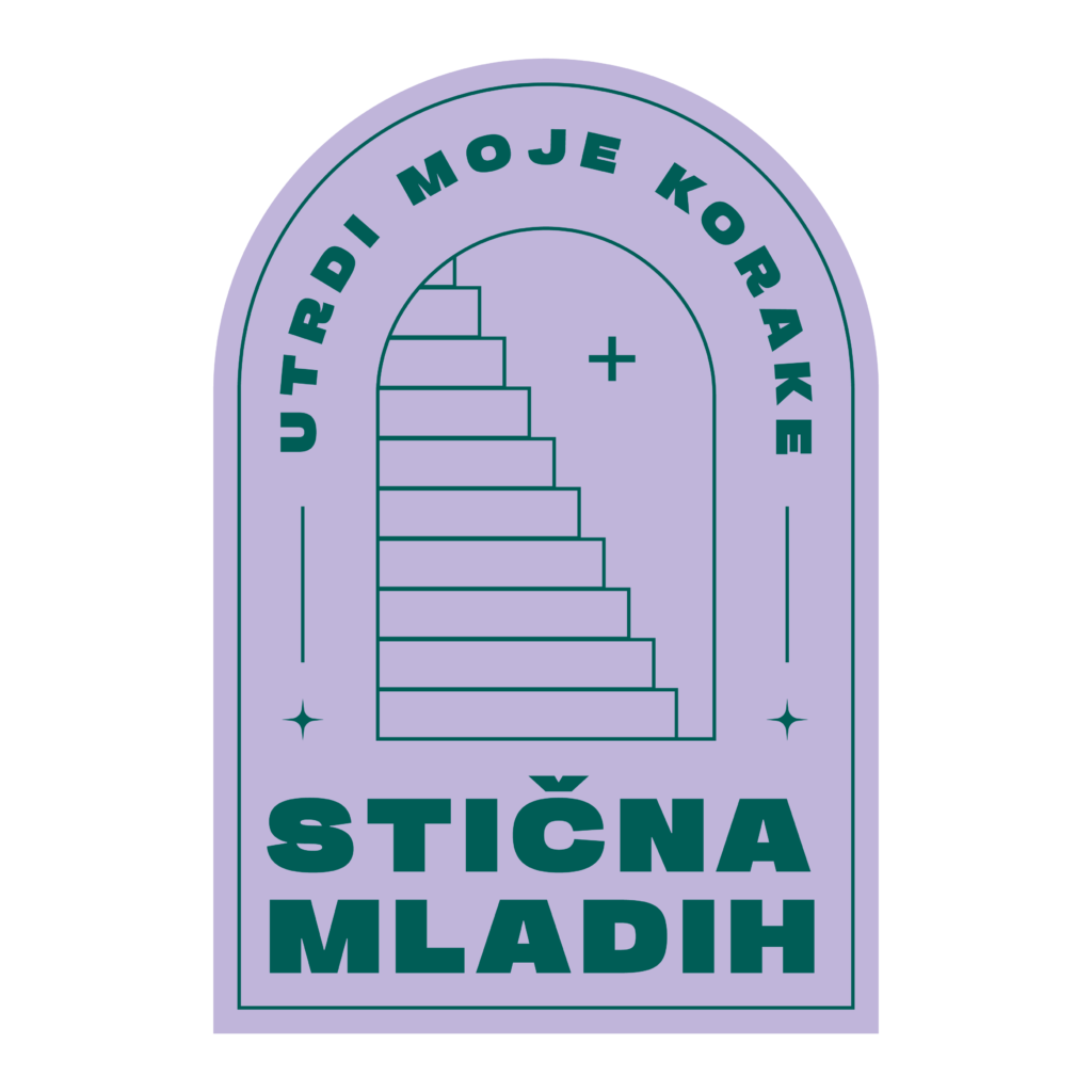
After adapting the logotype to the anniversary, the core team brainstormed about the festival theme and we ended up with a quote from Psalm 40 – “Make my footsteps firm / Utrdi moje korake”. The decision was made while researching the needs and facts about Gen Z and the current issues they are facing because of Covid-19. The main problems are that young people are insecure, they are afraid of their future and their ‘’steps are unstable’’. With the festival content and visual identity, we wanted to show them that their future is bright if they trust in God, who is there for them and will not let them down. We want to help our target group to overcome their fears and insecurities in the given situation.
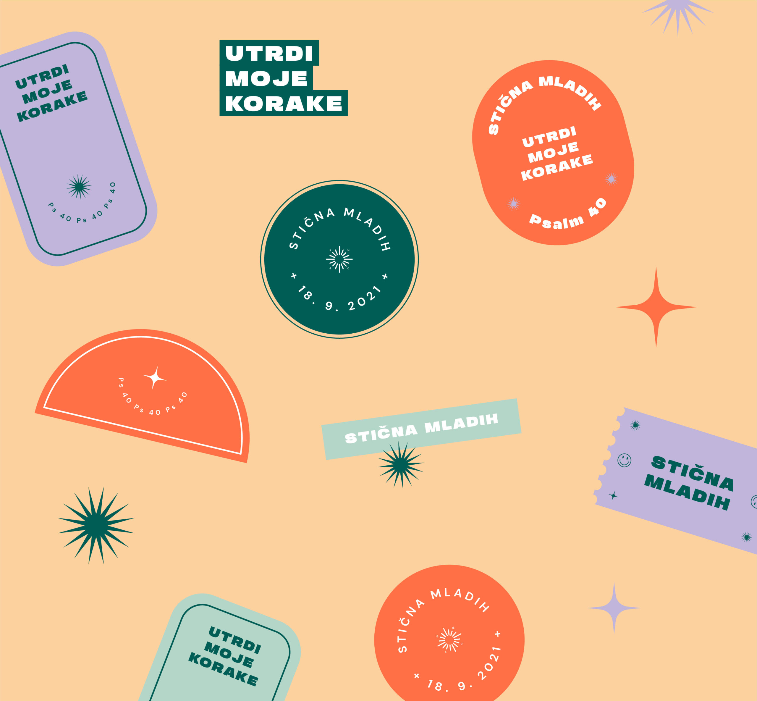
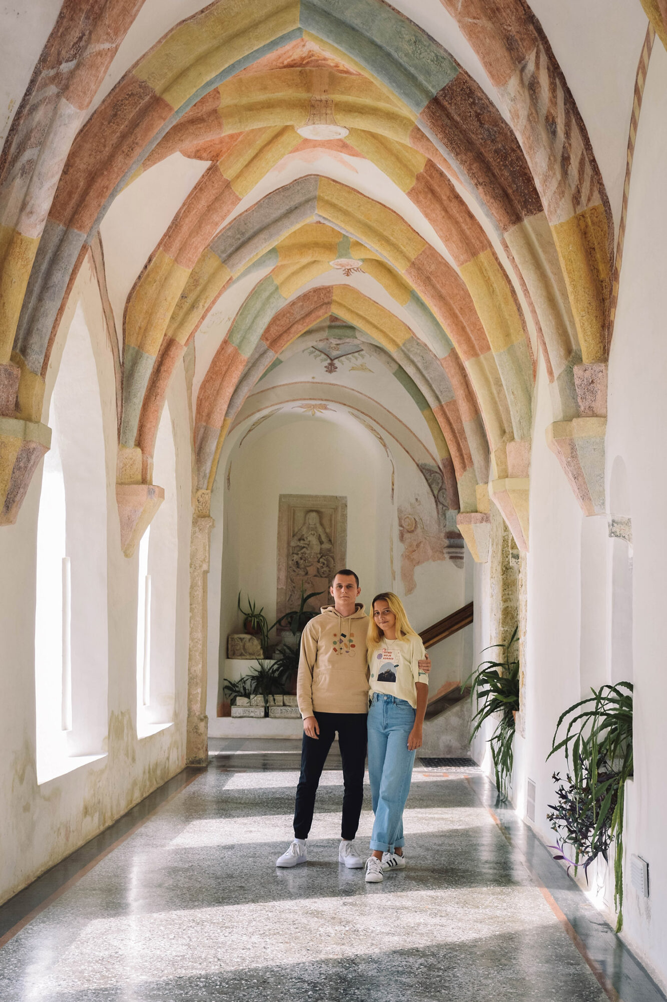
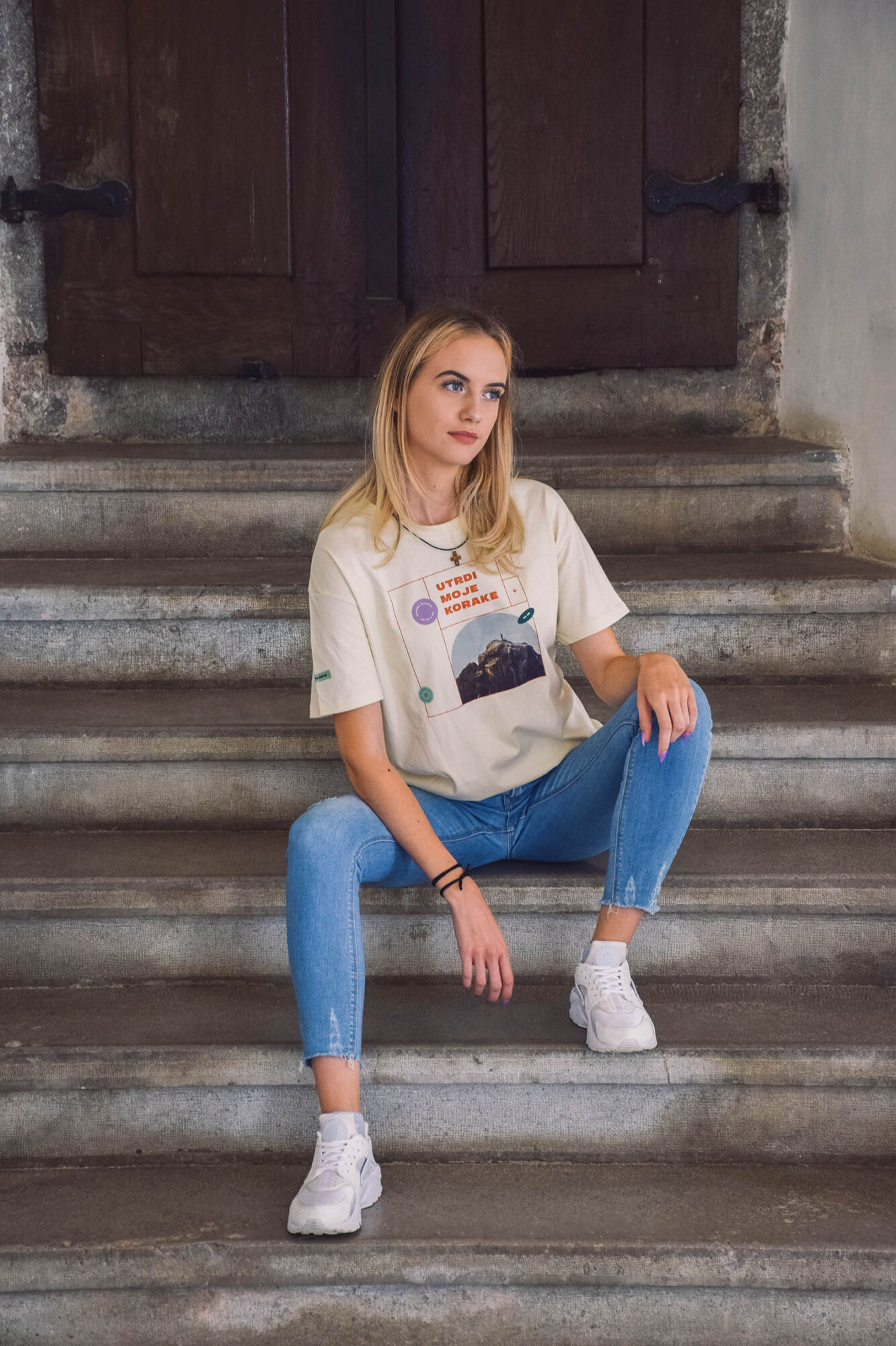
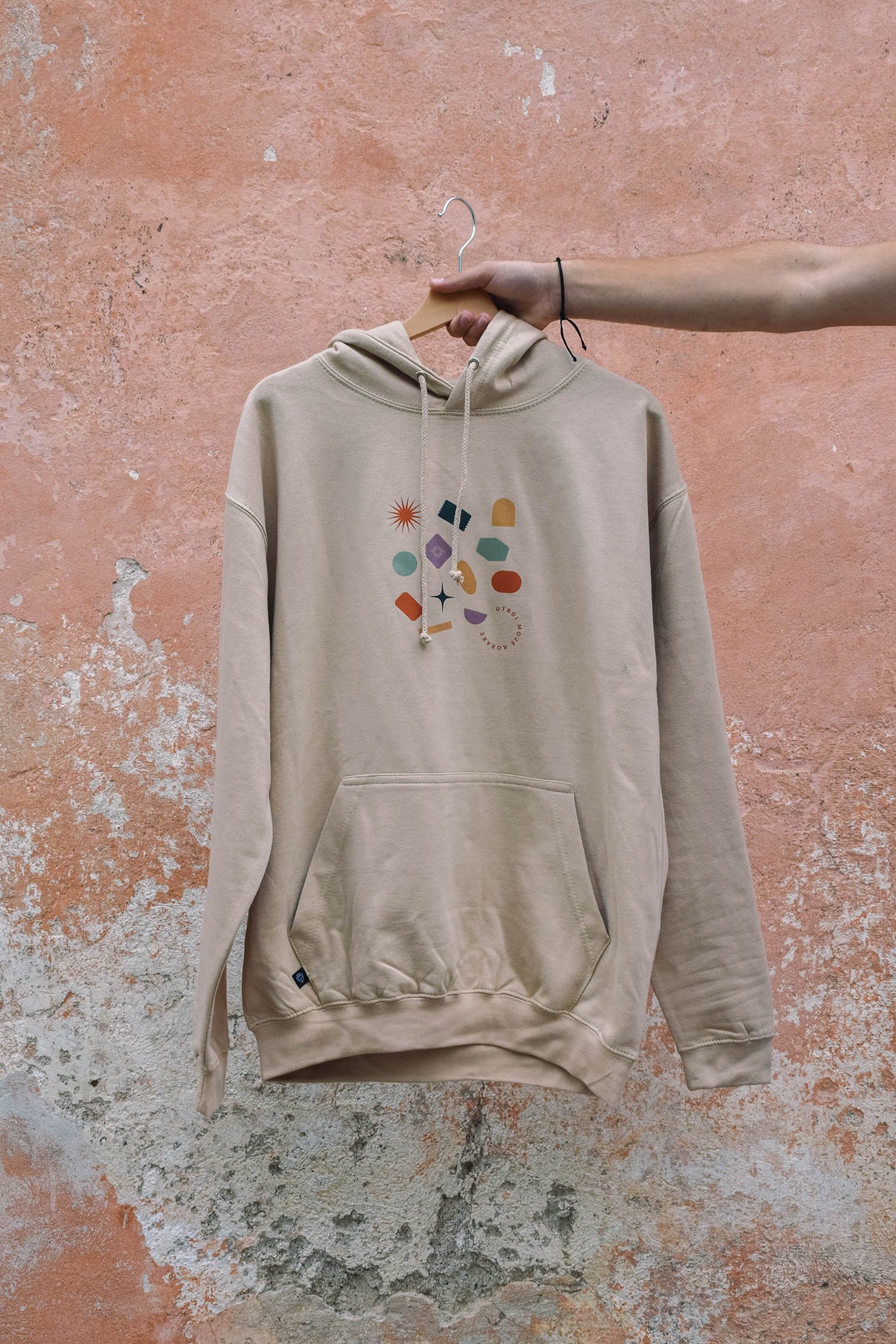
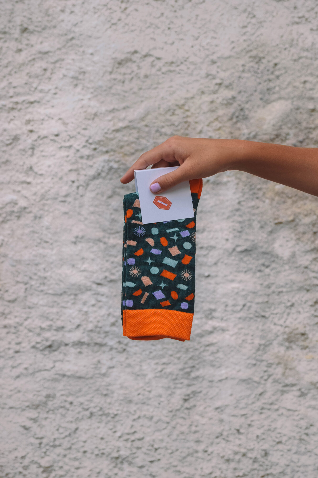
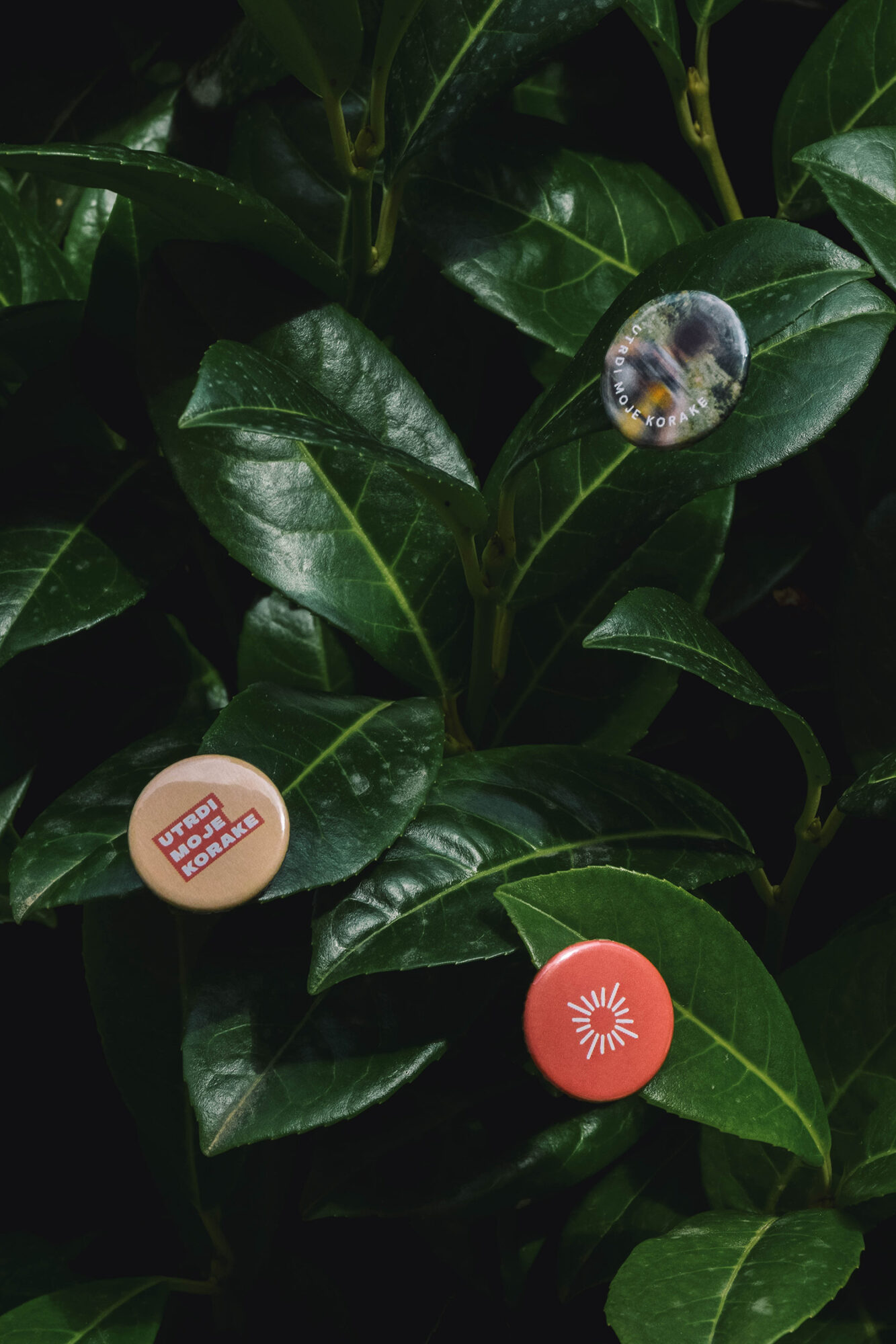
The online survey we conducted last year helped us to see where to pay attention to this year’s visual identity. Because it was a jubilee festival, we wanted to emphasize tradition and connect it with the 2021 visual aspects. We achieved this with a colour palette that is retro and modern at the same time, with playful stickers that represent youth and concert vibe, with bold typography and photo selection.
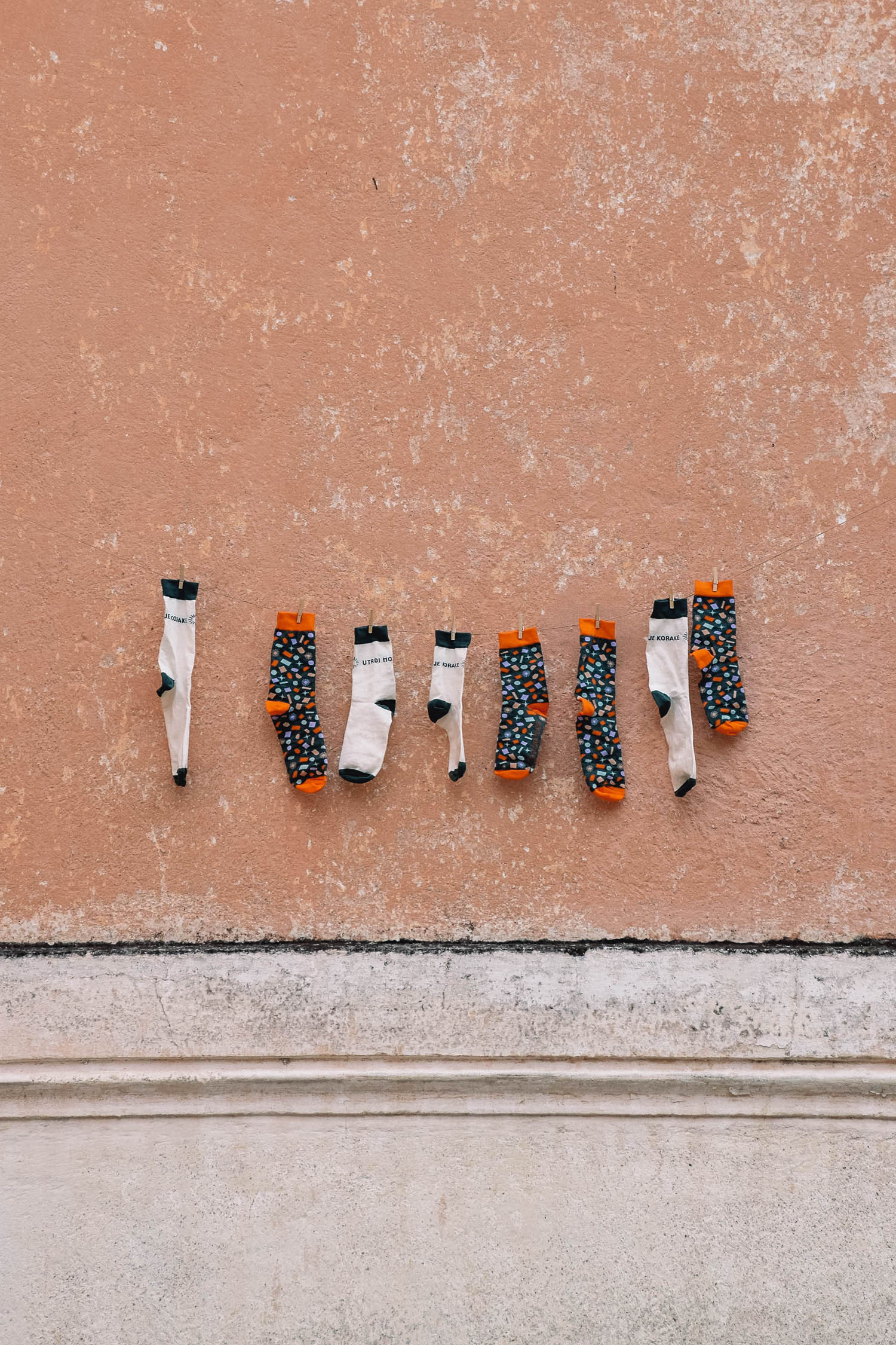
A part of my team’s job was also to brainstorm, select and design merchandise for the event. We decided to include around 10 products and we designed them according to the visual identity.
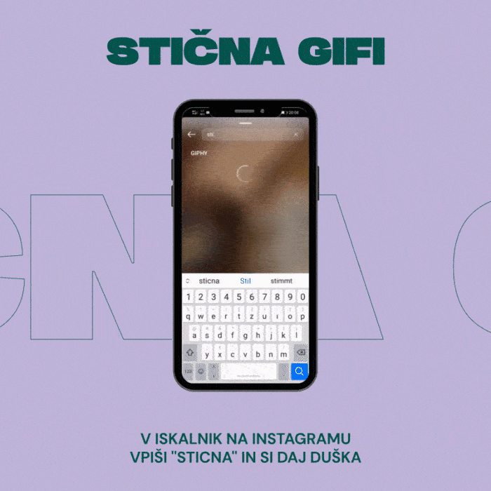
Our team was also responsible for other design areas, including website building, app UI/UX, social media posts and stories, wayfinding, web animations, stage screens animations, promotional materials, accreditations, billboards, posters, bus screen animations, Instagram AR filters and GIFs.
We can just say that the festival was a big success and that the 2500 young participants really felt the vibe and were more than excited about next year’s festival. Me and 200 other volunteers were exhausted but happier than ever. Would do it again 10/10.

WHAT I LEARNED &
SKILLS I GAINED
I learned about project management because I handled the event’s visual design, with a focus on web and motion aspects. As a result, I obtained team leadership experience while also operating under pressure. Another thing to keep in mind is risk management — with the Covid-19 situation, we had to create multiple possible festival scenarios. The last ten days were quite stressful, but fortunately for us, everything went well and according to plan.

MERCHANDISE
We attempted to design wearable items that aligned with the festival’s aesthetic language. Based on the results of a survey in which we asked our consumers about their product preferences, we designed a variety of designs for various surfaces and goods.

augmented
reality
experience
In order to stay up with the youth population, we created a variety of augmented reality experiences. You may still check them on Instagram at @sticnamladih.

media links
Here you can find
all my work
Creating graphic/web/visual/motion work for the past 5 years. Explore all my projects here.


