
Visual identity and web design for
FESTIVAL
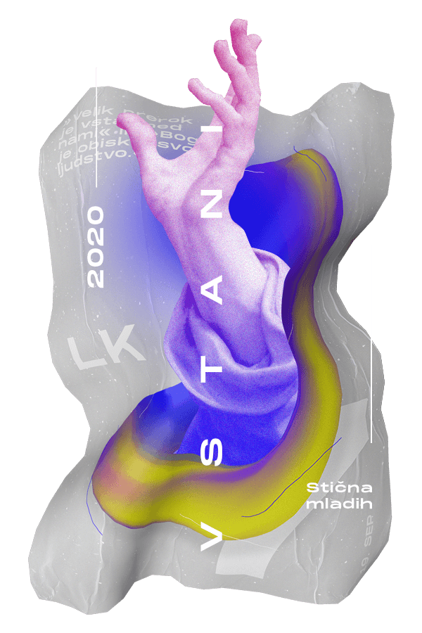
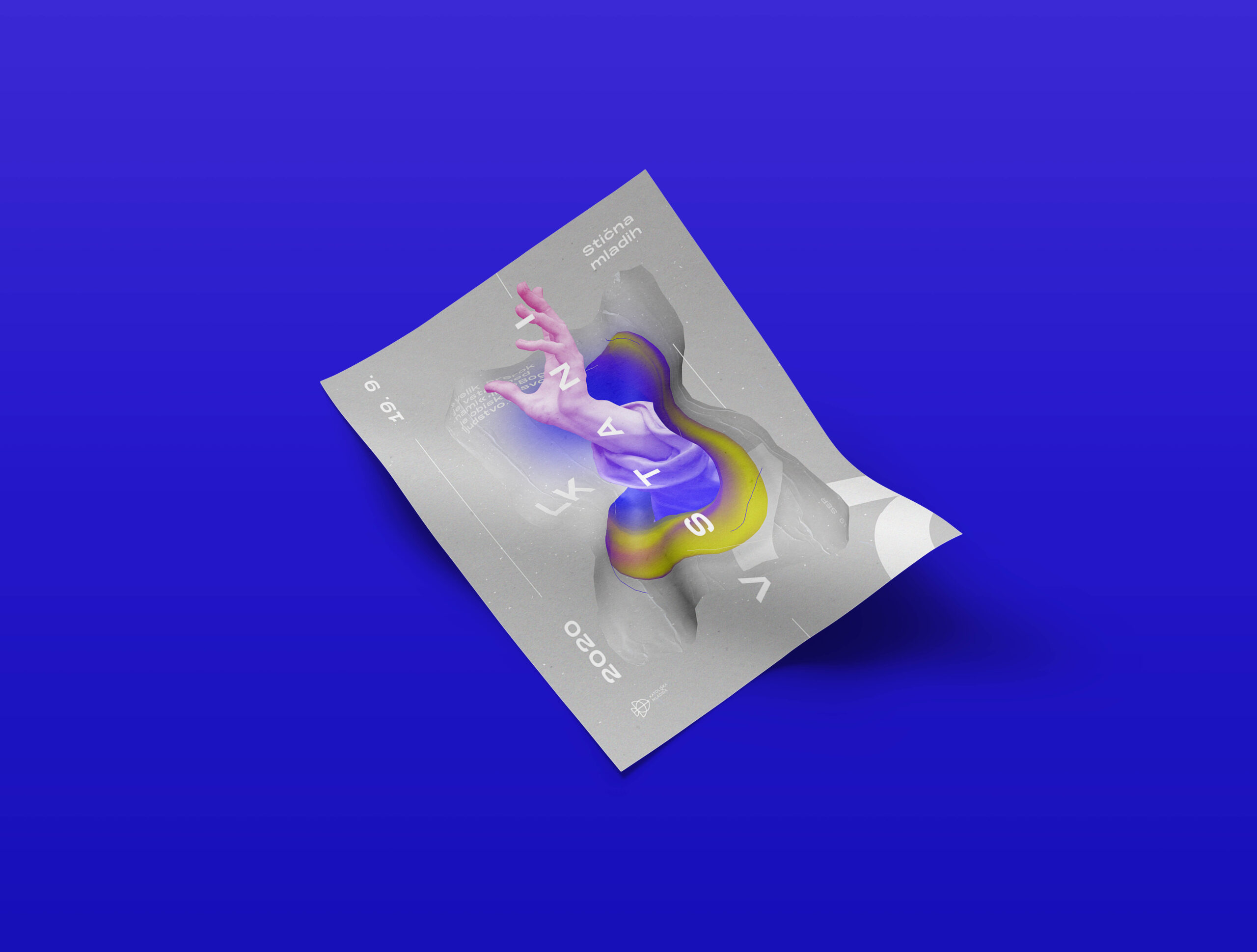
STIČNA MLADIH
2020
CLIENT – Stična mladih
KEYWORDS – branding, web design, merchandise
TEAM MEMBERS – Marko Javeršek & Kaja Bukovec
YEAR – 2020
PROJECT / CLIENT DESCRIPTION
Stična mladih is the biggest Slovenian youth festival with 40 years of tradition and recognition. Every September, it attracts more than 4000 young people who want to deepen their faith and become better humans. The Festival lasts one day and includes concerts, workshops, chill out zones, sports activities and mass.
MY ROLE – branding, graphic design, web design, 3D design, merchandise, motion design
CHALLENGE, PROCESS
& SOLUTION
Organizers’ expectation was to put the visuals of the festival on the next level, so the biggest challenge was to bring the design closer to youth and to follow the latest design trends.
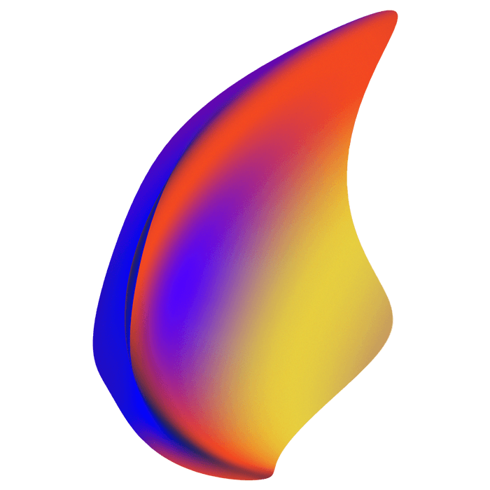
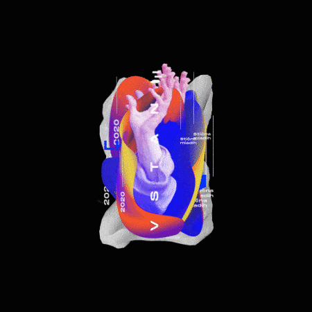
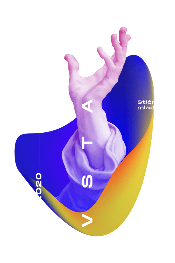
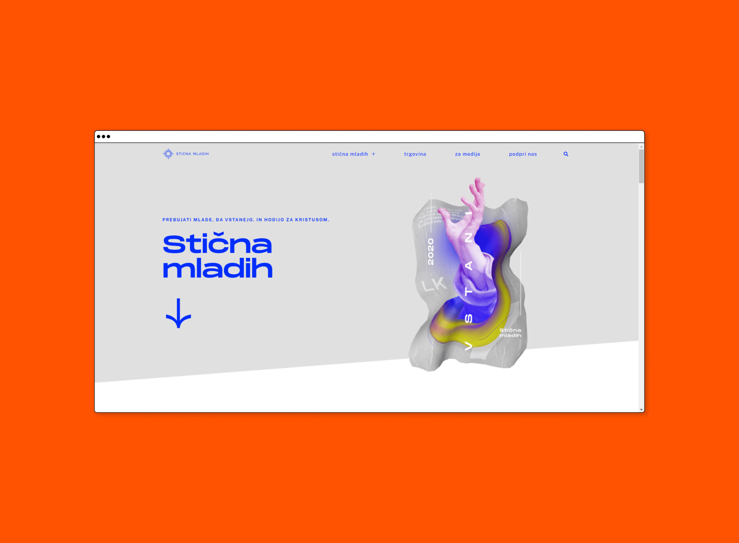
After redefining our user group’ needs and analysing the previous festival identities, we planned the festival visual transformation, starting with a logo redesign. The new logo reflects festival tradition, purpose and is aligned with its strategy. The main elements are circle, square, lines and symmetry. It is ambiguous and can be interpreted as a spark, cross, junction, eucharist, route or you name it. We managed to connect all those areas and present them with one single logotype that instantly gained recognition amongst festival participants and media.
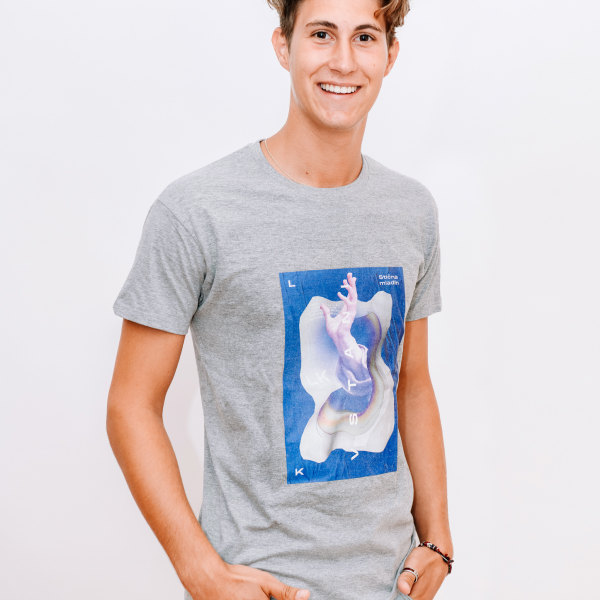
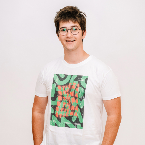
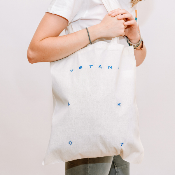
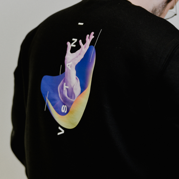
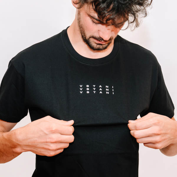
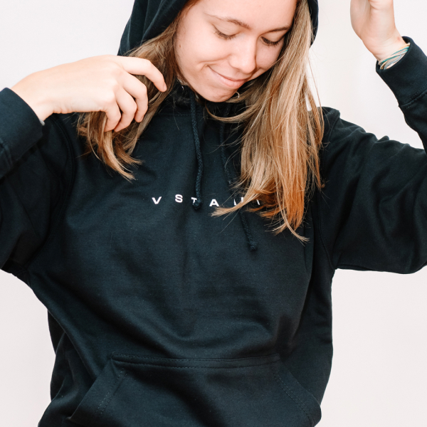
Based on user research we defined the theme of the festival, based on Lk 7 bible citation (“Vstani” or “Get up”), which encourages young people to get up and do something with their lives. Event identity planning followed. To attract our target group, we added 3D elements, vibrant colours and bold typography. All merchandise and promo material was aligned with visual identity and is communicating that the festival is contemporary and made for youth.
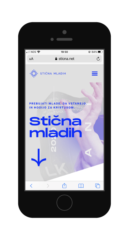
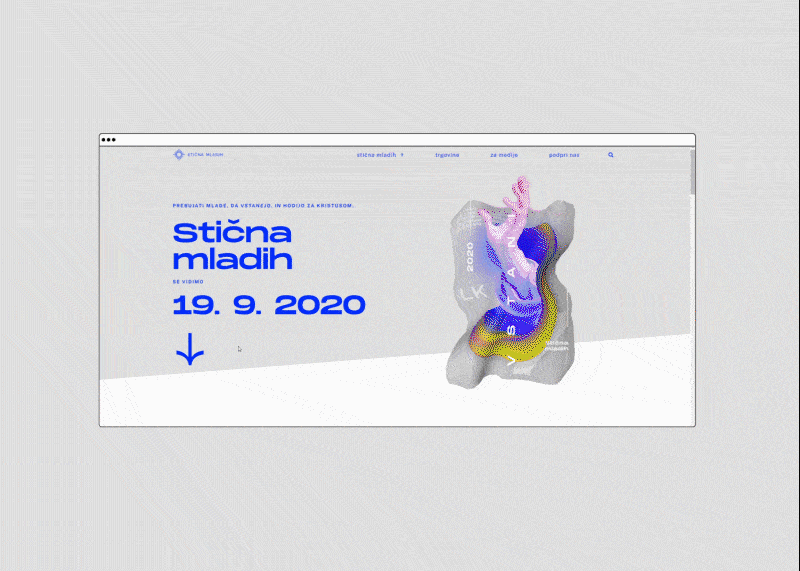
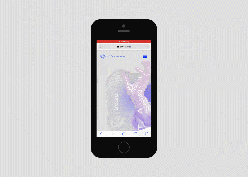
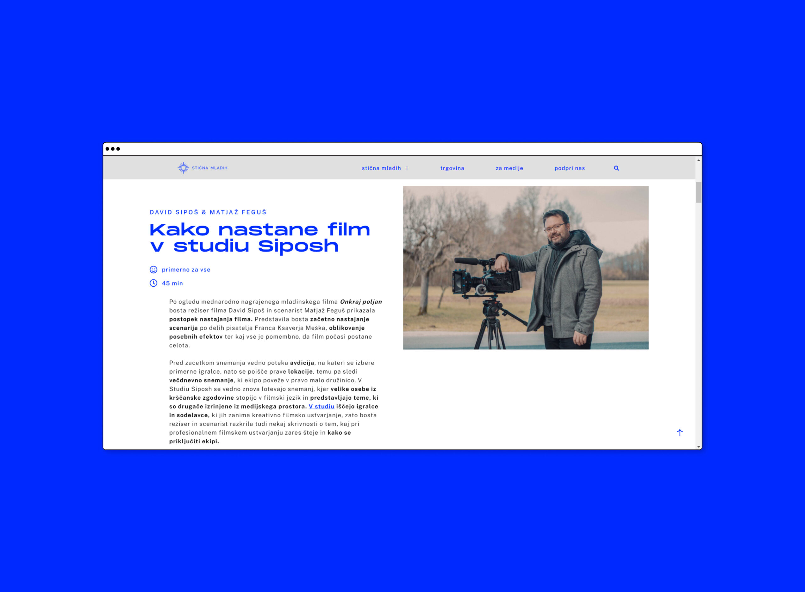
While planning the website structure, content and visual design system, we focused on clarity, UX, motion graphics and followed design trends of 2020. In the last weeks before the festival, more than 23 000 unique users visited the website.
After the event, we conducted an online survey and more than 80 % of participants were impressed by the website and 75 % of festival participants liked visual identity. Those who were not very impressed emphasized that the colours were too saturated for their taste and that they expected the identity to be more gentle and cute. But those who were super impressed by the renovated branding and web presence commented that the festival finally gained design power, that they like colour combinations and boldness, that the identity is very contemporary and that the merchandise is awesome
WHAT I LEARNED &
SKILLS I GAINED
I learned and experienced the project management aspect of the design. This event is visited by thousands of participants every year, and with it, the responsibility grows as well. I would also highlight the importance of following visual coherence.
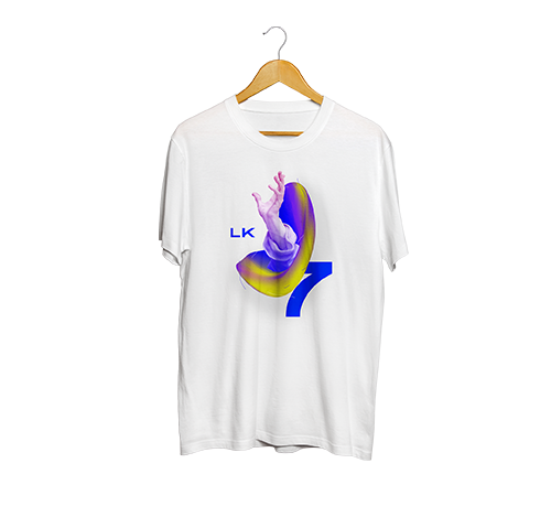
MERCHANDISE
Besides visual identity and web design, I created lots of other works for events, books, posters, social media, merch, etc.
Here you can find
all my work
Creating graphic/web/visual/motion work for the past 5 years. Explore all my projects here.


