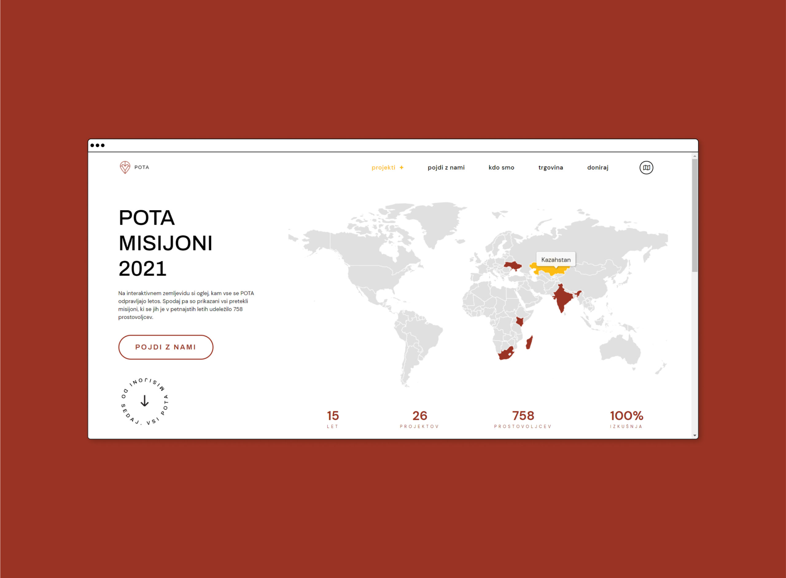
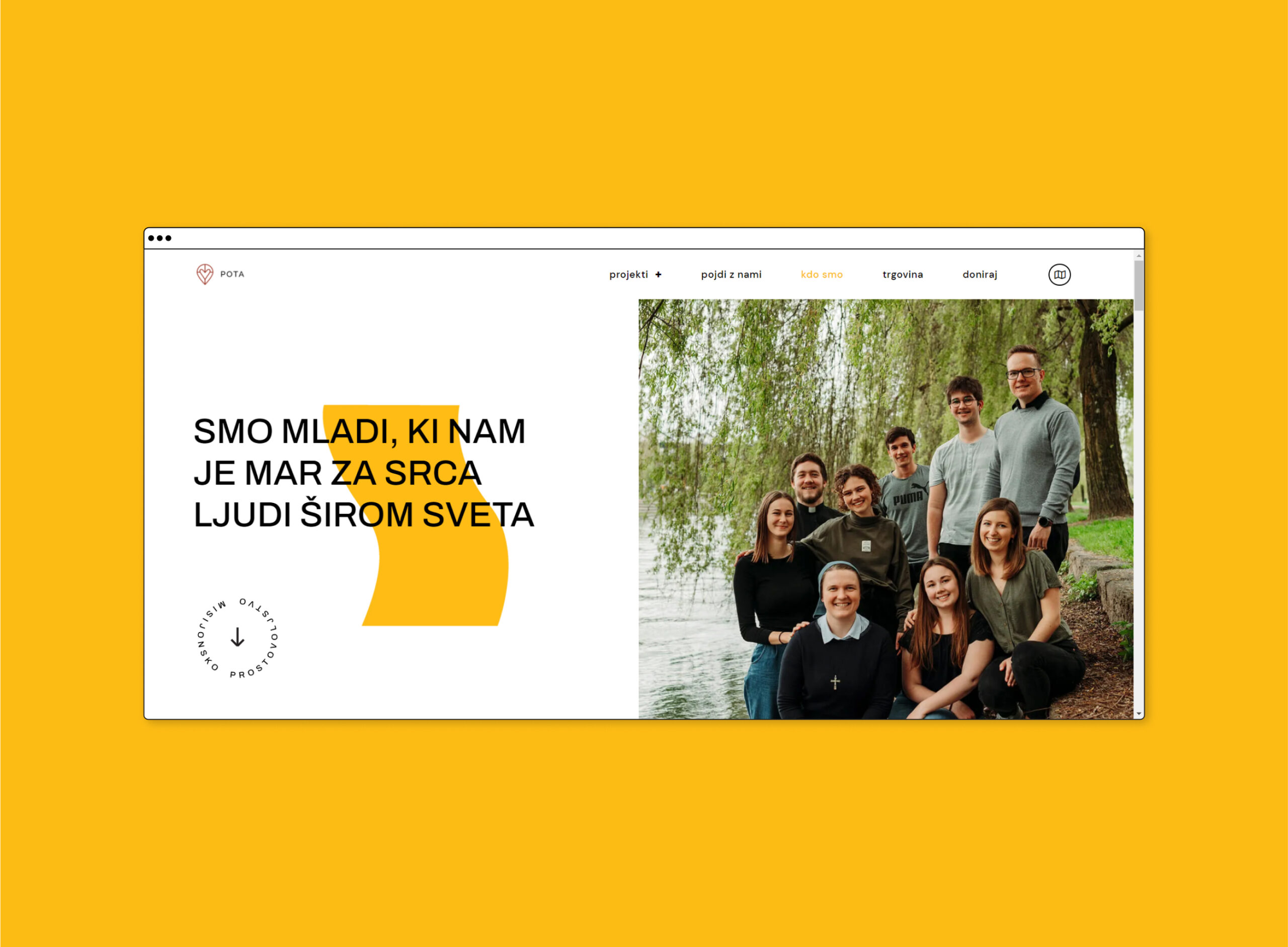
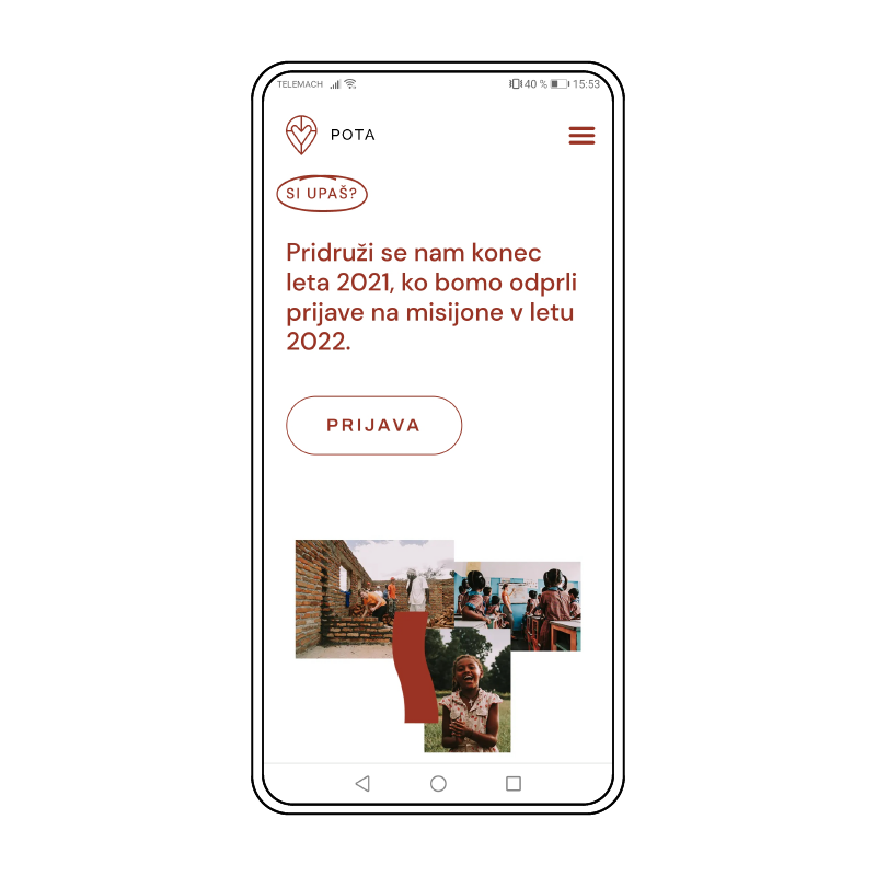
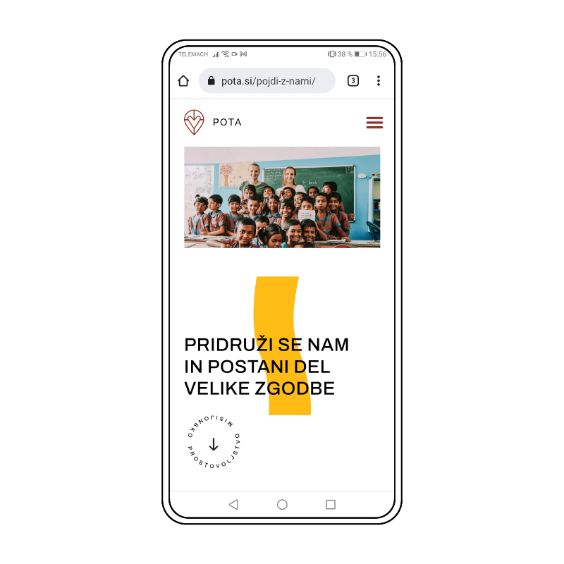
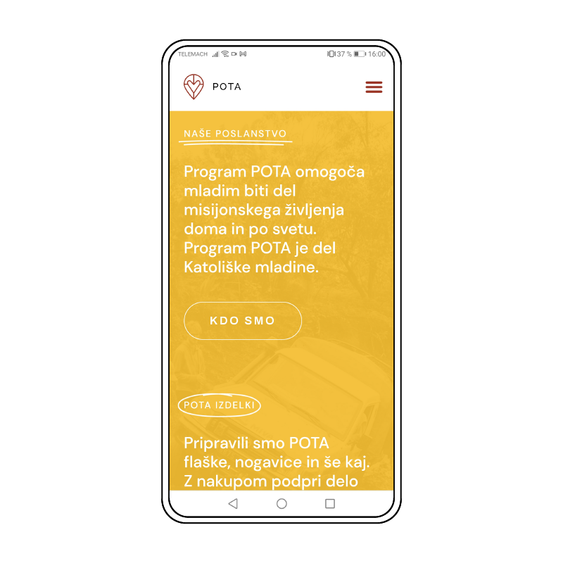
For 15 years, the POTA program has enabled young people to volunteer in missions around the world and at home, during the summer months. They are young people who care about the hearts of people around the world.
MY ROLE – rebranding, web design
CHALLENGE, PROCESS & SOLUTION
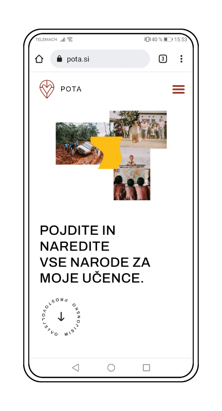
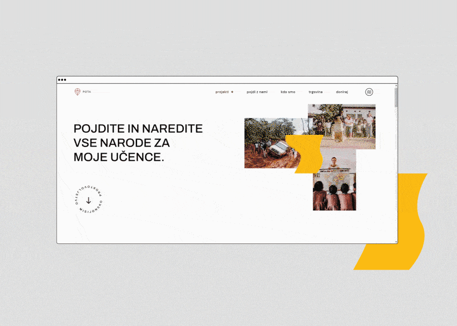
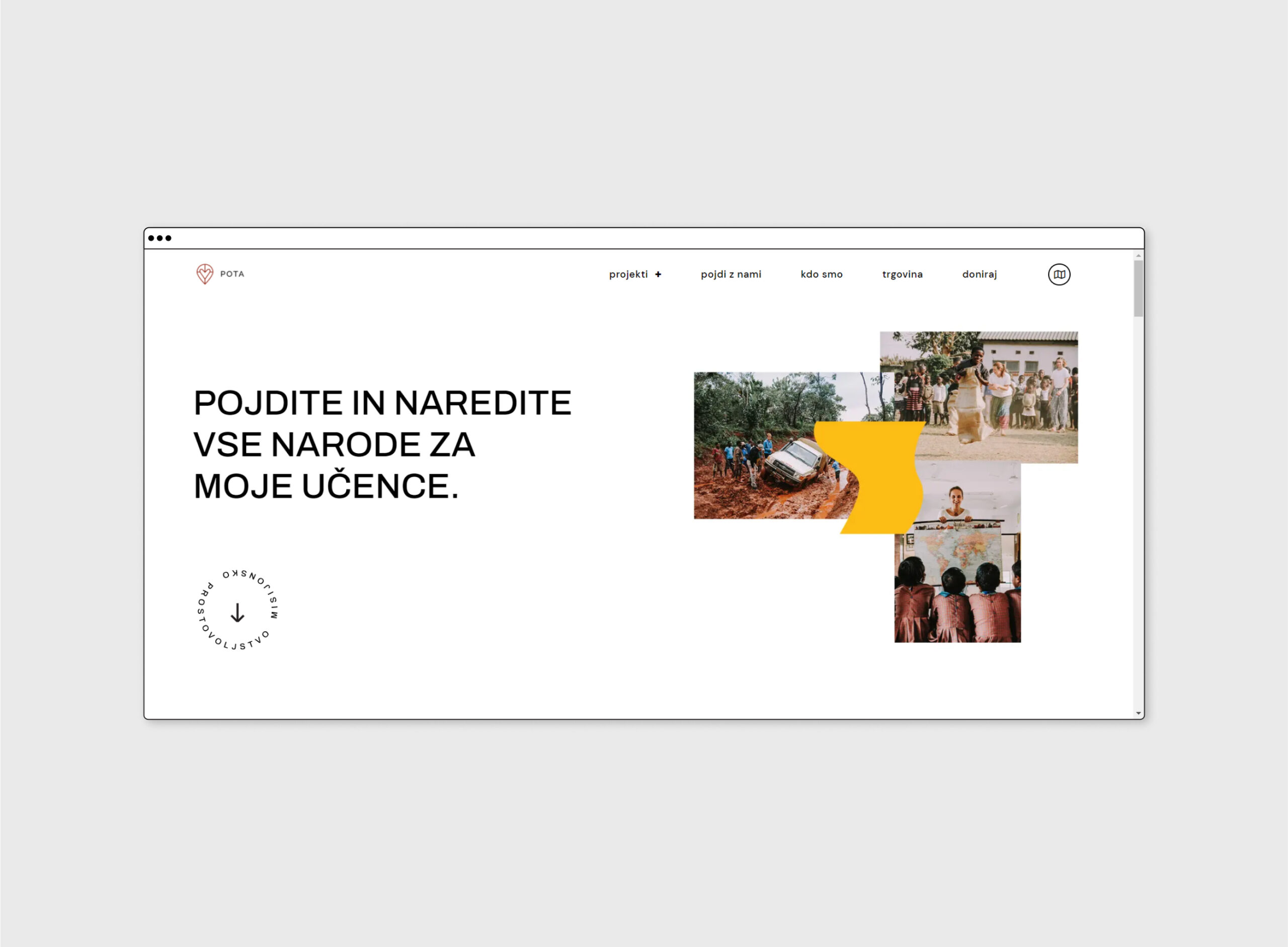
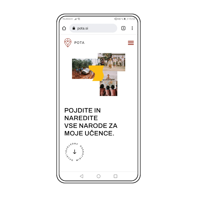
Amongst the people, POTA (translated as “path”) is associated with travel, volunteering and faith. With the rebranding, we wanted to show all those associations when one looks at their logotype. Colours remind us of the dirt roads and colourful cities, and the shapes represent the different paths in which volunteers can collaborate with the organization.
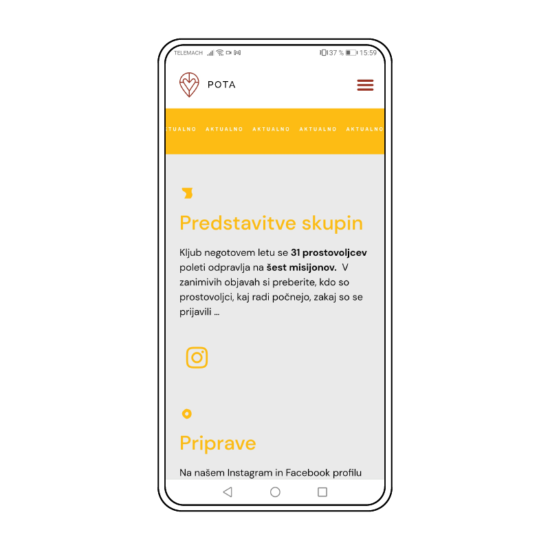
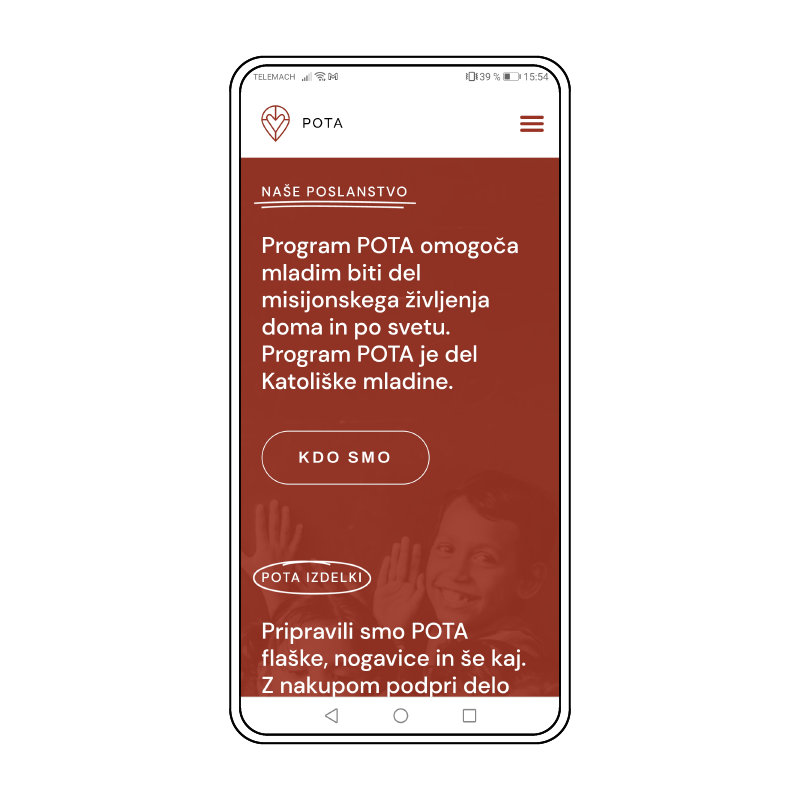
The website is primarily informative therefore it needs to be clear and easy to navigate through. The main goal was that organization gains visual recognition with the implementation of the brand identity into the website. It is still playful, interactive and attracts young volunteers to join the team.
WHAT I LEARNED & SKILLS I GAINED
This project represents the breaking point in my workflow history. It was the first project that I dive into user experience design. I used several steps, from the interviews, user flows, to wireframes and prototyping. I learned about user experience and interface and gained extensive knowledge in programs like Figma and Elementor. I also gained a deep respect for all POTA volunteers & I would like to join them for a trip as soon as possible!
work
Here you can find
all my work
Creating graphic/web/visual/motion work for the past 5 years. Explore all my projects here.